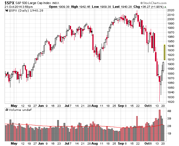
Look at the last couple weeks of trading on the S&P 500:
This is a panic down-panic up type chart – especially over the past few days, it resembles a short squeeze more than anything else.
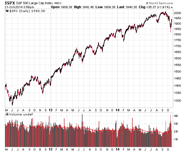
The overall trend in the S&P 500 over the past couple years has been nearly a straight-line up chart:
Is this going to continue?
Normally in the prior market dips you get this “slowly climb the wall of worry” effect, but this time it appears to be different.
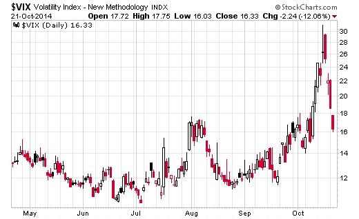
Implied volatility continues to be strongly anti-correlated to market price, but is now settling back into the teens again. Will there be another violent outburst?
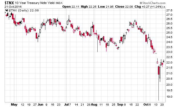
And finally, 10-year bond yields are still trading below what they were when this whole market calamity started:
I’d be careful. My guess is that we’re going to see some stormy seas over the next couple months. Whatever started this is not likely finished yet.


