There are two standardized mathematical methods of measuring raw performance (non-risk adjusted) and that is time-weighted and dollar-weighted returns. I won’t get into the definitions (go to investopedia for a good primer), but either method is legitimate. Typically funds that have lots of inflows and outflows use dollar-weighted returns, while time-weighted returns allows for an “apples to apples” performance comparison between funds.
Something we almost never question is the unit of measure that we use to evaluate such performance. This is most typically in the currency of the portfolio construction. For Canadians, this is usually in Canadian dollars, although it can be acceptable to use US Dollars as well.
However, is this yardstick, the currency, a correct one? It is very easy to overlook as this core assumption is baked into everybody’s consciousness that the currency is stable. Times are changing, however, where we now have to question the currency we use.
I looked at a couple alternative measures of past performance.
One alternative measure is the portfolio value in relation to the price of gold – i.e. performance in how many ounces of gold you could purchase at quarter-end. Using this metric, despite the fact that I have fared reasonably well in the COVID crisis, I have not done that much better today in relation to gold since the September 2018 quarter. In fact, going back as far as I could with some moderately reliable records, my performance, as strictly measured in gold, for the past 15 years has been about 7% compounded annually (compared to roughly 19% if you use a standard time-weighted return). This is a huge difference in performance – it shows that I am barely treading water.
If I use crude oil as a benchmark, I’m making out like gangbusters.
Another common measure is benchmarking to an index – relating your portfolio performance above or below the overall TSX Composite or S&P 500 is popular. Indeed, when I do my regular performance reports, I include those indices as a benchmark, simply because if I could do just as well (or better) sticking my money in an index fund, there’s no point in me bothering to do any investment research at all (indeed, I’d be adding negative value with every minute spent on investment research!).
I’m always cognizant that my past performance could purely be a function of luck. While depressing to think about, it is a possibility.
Another measure is benchmarking your portfolio to real dollars (instead of nominal dollars). This doesn’t change too much since reported CPI figures are under-reported (typically around 1.5% per year), so I do not consider this a useful measure. However, for marketing purposes, fund managers can claim victory in that most of them will show “your purchasing power will increase” – a 1.5% friction to nominal performance is not too difficult to overcome when central banks are applying a category 4 hurricane tailwind to your portfolio, especially if you invested in Tesla and Nio.
Is using real dollars to benchmark absolute performance correct?
I’d view M2 as a better barometer, as it reflects the fraction of currency that you control of the entire float of currency (that gets created through loans and central bank actions). This represents cash and cash-like instruments at banks. Over the past five years, it (USA) looked like this:

Very roughly, M2 has increased about 6% a year from 2016 to 2020. Going back earlier, we have the following:
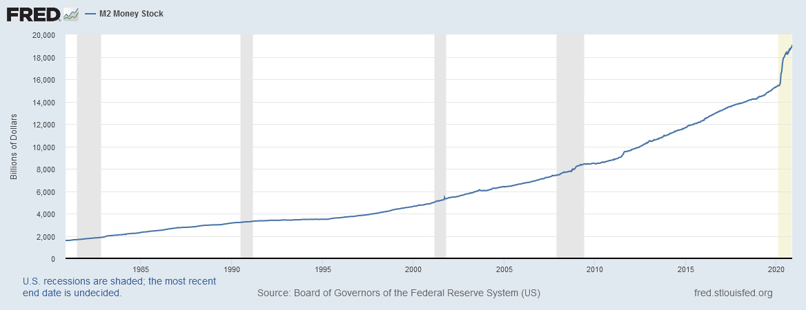
We see during the economic crisis that the overall trend did not really change (there was a mild inflection) but during the COVID crisis, it really ramped up. Assuming the year ended today, M2 in the USA has increased by a factor of 24%. Needless to say, this is unprecedented in the past 40 years of financial history.
When applying M2 from 2005 to present, the growth has been about 7% compounded annually. Hence, my “real” performance as measured by USA M2 is about 12%.
Canada (Bank of Canada Statistics) has a similar M2 curve, please forgive my thirty second excel job on this dataset:
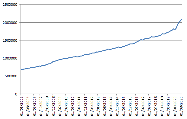
While their M2 is only refreshed up to September 1, 2020 (the USA data is updated weekly and is current), Canada’s M2 growth over the past 15 years is roughly 5% compounded. From January 1 to September 1, M2 growth in this year alone has been about 15%.
I generally believe that measuring absolute performance in relation to monetary aggregate growth is a more realistic measure than using CPI. There are still deficiencies using this as a yardstick, but the overall point of this exercise is to use different ways of measuring absolute performance.
Interestingly, if you relate USA M2 to the S&P 500 index, the price index return of the S&P 500 is roughly equal to the growth of the M2 over the past 15 years. The 15 year price return of the TSX Composite has lagged the growth in Canada’s M2 – using this metric, an index investor has barely kept afloat when you factor in dividends.
I deeply suspect we are all doing a lot worse in absolute terms than our nominal and real returns indicate – something to keep in mind when measuring our financial objectives.
That’s a very interesting perspective. If you compare Vancouver detached real estate prices to M2, it seems much more flat.
Interesting. On this graph the 2008 QE seems quite negligible comparing to 2020 QE, while in my mind 2008 was the real structural crisis, whereas covisis seemed to be a temporary thing.
Do you think this will affect all kinds of performance and other metrics, that any comparison to pre-covisis data will have to adjusted? P/Es, ROA / ROEs, yield curves, perpetual growth rates…
It’s tough to say. Clearly 20-21 comparisons will be Covid-adjusted for affected industries, but the constant currency assumption with comparisons is a fairly ingrained construct (sometimes adjusted by the 1.5-2% CPI) but nothing at all in relation to other benchmarks (including M2).
I do not think governments would want the public to benchmark their absolute wealth to the monetary stock.